Absolute Beginners: Start Here
Quick word on: WordPress
The 3-Part Journey
1. Website Basics
2. WordPress
3. Builders
Website Basics
1. The Internet & How Websites Work
1.1 What is the internet The internet is a massive global network that connects millions of computers and devices to each other. Think of it like a giant invisible web that links people, businesses, and information all around the world. When you go online, you are connecting to this network and gaining access to an enormous amount of information, services, and communication tools.

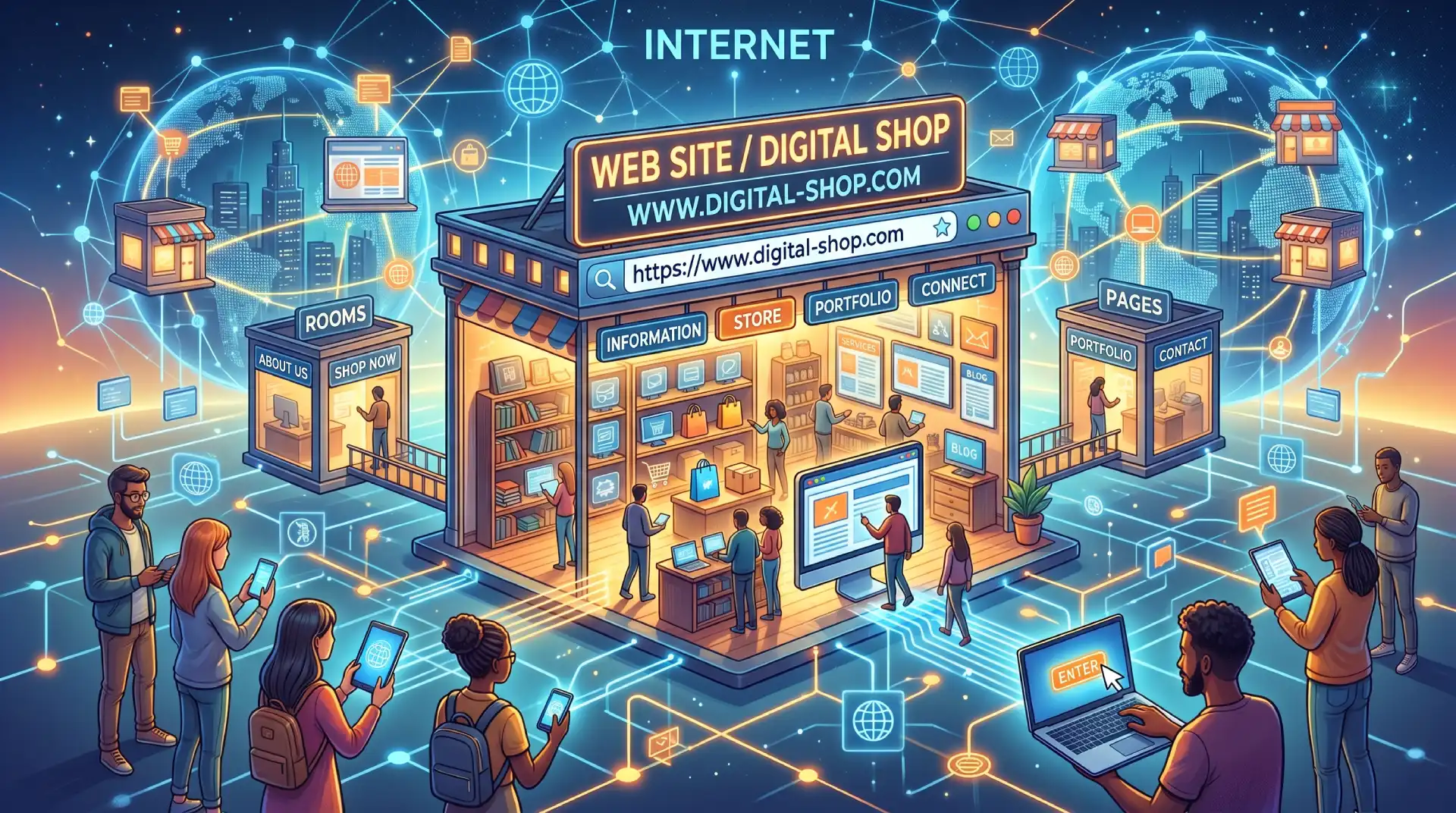
1.2 What is a website A website is a collection of pages that live on the internet and can be visited by anyone with a browser and an internet connection. Just like a physical shop has an address, a name, and rooms full of information or products, a website is the digital equivalent. It can be used to share information, sell products, showcase work, or connect with people.
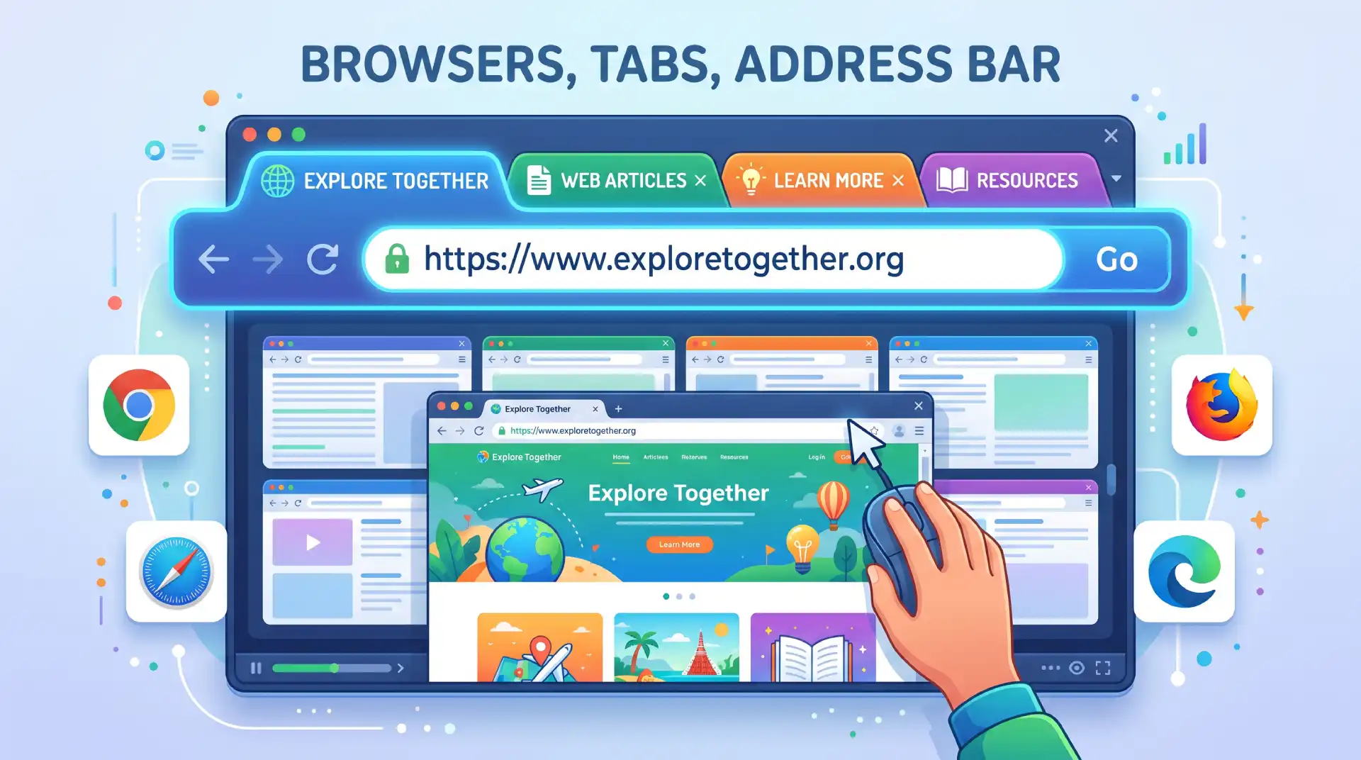
1.3 Browsers, tabs, address bar A browser is the application you use to access and view websites — examples include Google Chrome, Safari, Firefox, and Microsoft Edge. At the top of your browser you will find the address bar, where you type in a web address to visit a site. Tabs allow you to have multiple websites open at the same time without opening a separate window for each one.
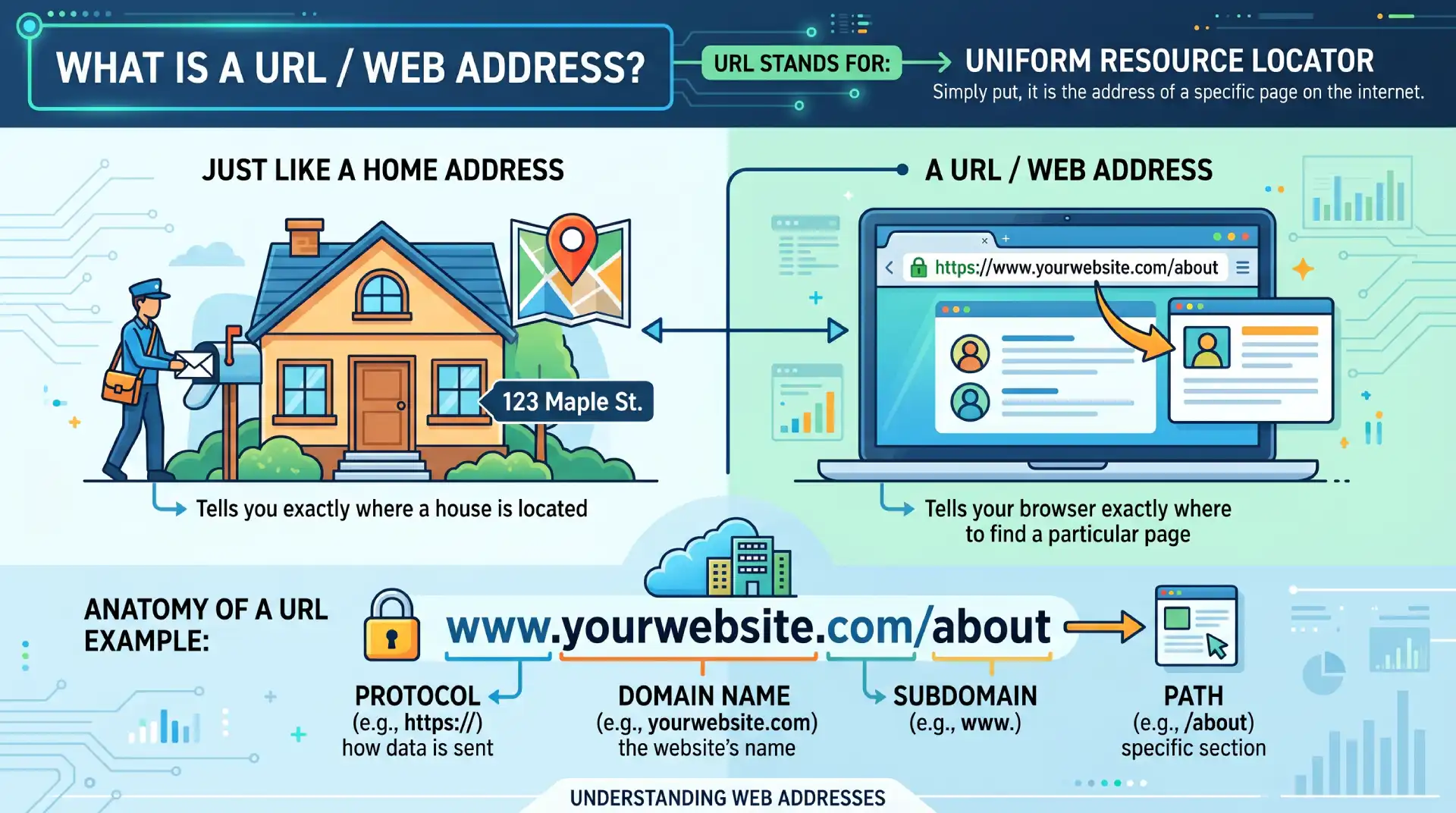
1.4 What is a URL / web address URL stands for Uniform Resource Locator, but simply put it is the address of a specific page on the internet. Just like a home address tells you exactly where a house is located, a URL tells your browser exactly where to find a particular page. An example would be www.yourwebsite.com/about, where each part of that address has a specific meaning.
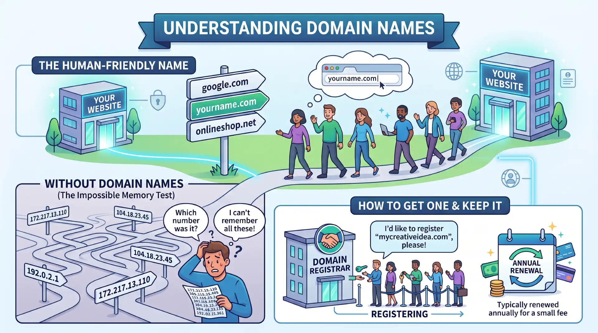
1.5 Domain names A domain name is the human-friendly name of a website, such as google.com or yourname.com. Without domain names, you would have to remember a string of numbers to visit any website, which would be impossible for most people. You register a domain name through a domain registrar, and it is typically renewed annually for a small fee.
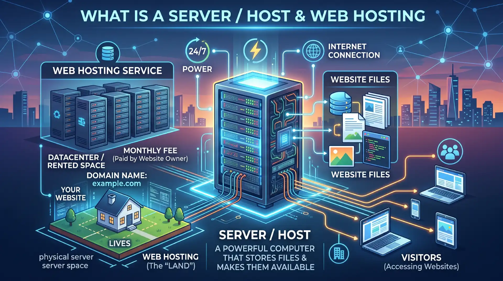
1.6 What is a server / host A server is essentially a powerful computer that is always switched on and connected to the internet, and its job is to store your website files and make them available to anyone who visits. Web hosting is the service you pay for to rent space on one of these servers. Think of it like renting a plot of land — your domain is the address, and the hosting is the actual land where your website lives.
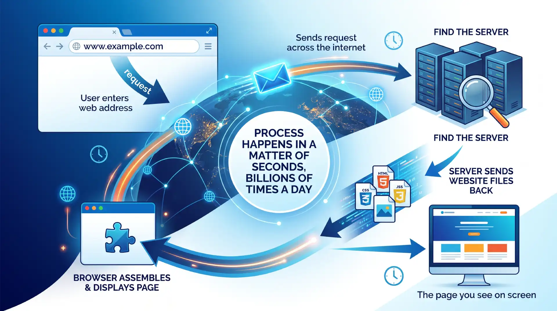
1.7 How a browser finds and loads a website When you type a web address into your browser, it sends a request across the internet to find the server where that website is stored. The server then sends the website files back to your browser, which assembles and displays them as the page you see on screen. This entire process happens in a matter of seconds, and it is happening billions of times a day all around the world.
2. Website Identity
2.1 Site title The site title is the name of your website, and it appears in two important places — at the top of the browser tab when someone visits your site, and in search engine results. It is usually your business name or your own name, and it helps people and search engines identify who you are. Keeping it short and clear is always a good idea.
2.2 Favicon A favicon is the tiny icon that appears in the browser tab next to your site title. It is a small but important branding detail — think of the little camera icon for Instagram or the colourful G for Google. It helps users identify your site quickly when they have multiple tabs open, and it adds a professional touch to your website.
2.3 Logo Your logo is the visual symbol or wordmark that represents your brand, and it typically appears in the header of every page on your website. It is usually one of the first things a visitor sees, so it plays a big role in making a strong first impression. Most logos are image files that you upload to your website and link back to the homepage.
2.4 Brand colours & fonts Brand colours and fonts are the consistent visual choices that make your website look and feel like it belongs to you. Just like Coca-Cola always uses red or McDonald’s always uses yellow, your website should use a defined set of colours and fonts across every page. This consistency builds trust and makes your site look professional rather than thrown together.
3. Website Structure & Layout
3.1 The structure of a website: header, canvas/body, footer Almost every website follows the same basic structure from top to bottom. At the top is the header, which usually contains your logo and navigation menu. In the middle is the main canvas or body, which is where all your page content lives. At the bottom is the footer, which typically contains contact details, links, and legal information like copyright notices.
3.2 Navigation & menus Navigation refers to the system of links that helps visitors move around your website. It is most commonly displayed as a menu in the header, with links to your main pages such as Home, About, Services, and Contact. Good navigation is simple and clear — if a visitor cannot figure out how to get around your site within a few seconds, they will likely leave.
3.3 Types of navigation There are three main types of navigation on a website. The first takes you to a different page on the same website, such as clicking from the Home page to the About page. The second takes you to a different section on the same page, which is common on long single-page websites. The third takes you to a completely different website, known as an external link.
3.4 Typical homepage layout Most homepages follow a tried and tested layout that visitors have come to expect. It usually starts with a hero section — a large banner with a headline and call to action. Below that you might find a features or services section, an about section, a gallery, testimonials from clients, and finally a contact section at the bottom. This layout works because it tells your story in a logical, flowing order.
3.5 Pages vs posts A page is a static piece of content that does not change often, such as your About page or Contact page. A post is a piece of content that is part of a blog or news feed, published on a specific date and organised chronologically. The key difference is that pages are timeless and structural, while posts are time-stamped and regularly updated.
4. Page Building Concepts
4.1 Sections A section is a full-width horizontal block that spans the entire width of your page. Think of a page as being built from a stack of these sections, each one containing different content — a hero section, a services section, a testimonials section, and so on. Sections are the largest building blocks of a page, and everything else sits inside them.
4.2 Columns Inside a section you can divide the space into columns, which sit side by side horizontally. For example, you might have a two-column layout with an image on the left and text on the right. Columns give you control over how content is arranged across the width of the page.
4.3 Element boxes Inside columns you place element boxes, which are individual containers that hold a single piece of content. Each element box wraps around things like a heading, an image, or a button, giving you control over how that specific item is positioned and spaced.
4.4 Elements & content area Elements are the actual pieces of content you add to a page — things like text, images, buttons, and videos. The content area is the space inside an element box where that content lives. Understanding the difference between the container and the content inside it is one of the most important foundations of building web pages.
4.5 Padding, border, margin These three properties control the space around and between elements. Padding is the space between the content and the edge of its container — like the breathing room inside a box. Border is an optional line that runs around the edge of the container. Margin is the space outside the container, pushing it away from other elements around it. A simple way to remember it: margin is outside, padding is inside.
4.6 Hierarchy of elements: left to right, top to bottom, Z-index Web pages are built in a natural reading order — elements flow from left to right and top to bottom, just like reading a book. When elements overlap each other, Z-index determines which one appears on top. Think of Z-index like layers in a stack of paper — a higher Z-index means that element sits on top of the others.
5.Content Types
5.1 Copy (text) Copy is the term used for all the written text on your website — headlines, descriptions, button labels, and everything in between. Good copy is clear, concise, and written with your audience in mind. It is one of the most powerful tools on your website because it communicates your message and guides visitors towards taking action.
5.2 Images: photos, graphics, icons Images come in several forms on a website. Photos are real-world photographs used to create atmosphere or show products. Graphics are designed visuals such as illustrations or infographics. Icons are small simplified symbols used to represent ideas quickly, such as a phone icon next to a contact number. Using the right mix of these keeps your site visually engaging.
5.3 Video Video is one of the most engaging types of content you can include on a website. It can be used to introduce yourself, explain a product, or showcase your work. Videos are usually hosted on platforms like YouTube or Vimeo and then embedded into your website, rather than uploaded directly, to keep your site loading quickly.
5.4 Typical page elements Every website uses a core set of building blocks to present content. These include headings to introduce sections, paragraphs for body text, buttons to prompt action, icons for visual cues, images for visual interest, and columns for layout structure. Knowing these elements and how to use them is the foundation of building any page.
6. Typography
6.1 Headings & hierarchy (H1–H6) Headings are used to structure and organise the content on a page, and they follow a hierarchy from H1 down to H6. The H1 is the most important heading on a page — usually the main title — and there should only be one per page. H2s are used for major sections, H3s for subsections within those, and so on. This hierarchy helps both readers and search engines understand the structure of your content.
6.2 Body text / paragraph Body text is the regular reading text on your page — the paragraphs of information beneath your headings. It should be easy to read, which means choosing a legible font, an appropriate size, and enough line spacing so the text does not feel cramped. Most websites use a body text size of around 16 to 18 pixels for comfortable reading.
6.3 Fonts, Google Fonts, custom fonts A font is the specific typeface used to display your text, and your choice of font says a lot about your brand. Google Fonts is a free library of hundreds of fonts that can be used on any website. Custom fonts are fonts you purchase or download separately and upload to your site. Most websites use two fonts — one for headings and one for body text — to create visual variety while keeping things consistent.
7. Measures & Values
7.1 Pixels A pixel is the smallest unit of measurement on a screen, and it is the most commonly used unit in web design. When you set a heading to 48 pixels or give an image a width of 300 pixels, you are using fixed, precise measurements. Pixels are reliable and predictable, which makes them a good starting point for beginners.
7.2 Percentage (%) Percentages are used to set sizes relative to the parent container rather than a fixed value. For example, if you set an image width to 50%, it will always take up half the width of whatever container it sits inside, regardless of screen size. This makes percentages very useful for creating flexible, responsive layouts.
7.3 vw / vh VW stands for viewport width and VH stands for viewport height — the viewport being the visible area of the browser window. Setting something to 100vw means it will be exactly as wide as the browser window, and 100vh means it will be exactly as tall. These units are particularly useful for full-screen hero sections and backgrounds.
7.4 em & rem Em and rem are units used for typography and spacing that scale relative to font size rather than screen size. Em is relative to the font size of the parent element, while rem is relative to the base font size of the entire page. They are useful for creating designs that scale proportionally, and most page builders handle them for you behind the scenes.
8. Responsiveness
8.1 What is responsiveness A responsive website is one that automatically adjusts its layout and content to look good on any screen size, whether that is a large desktop monitor, a tablet, or a small mobile phone. Rather than building a separate website for each device, a responsive design uses flexible layouts and styling rules to adapt to whatever screen it is being viewed on.
8.2 Desktop, tablet, mobile views Web designers typically think about three main screen sizes when building a website. Desktop refers to laptops and large monitors. Tablet refers to devices like iPads. Mobile refers to smartphones. Most website builders allow you to switch between these three views while editing, so you can check and adjust how your site looks on each one.
8.3 Why it matters More than half of all web traffic now comes from mobile devices, so a site that only looks good on desktop is losing a significant portion of its potential audience. Search engines like Google also rank mobile-friendly websites higher in search results. Responsiveness is no longer optional — it is a fundamental requirement of any modern website.
9. Common UI Components
9.1 Typical blocks: text, image, icon, button, video, tabs, accordion, sliders Page builders come with a library of ready-made blocks you can drag and drop onto your page. Text blocks for copy, image blocks for visuals, icon blocks for symbols, and button blocks for calls to action are the most basic. More advanced blocks include tabs, which organise content into clickable categories, accordions, which hide and reveal content to save space, and sliders, which cycle through multiple images or pieces of content.
9.2 Popups A popup is a window that appears on top of the page content, usually triggered by an action such as clicking a button, scrolling to a certain point, or after a set amount of time. They are commonly used to display a special offer, collect an email address, or show an important notice. Used sparingly, they can be very effective — used too aggressively, they frustrate visitors.
9.3 Forms A form is a set of input fields that allows visitors to send information to you directly from your website. The most common use is a contact form, but forms are also used to collect email addresses for newsletters, gather survey responses, or take orders. Every form needs a destination — typically an email address or a connected tool like a CRM — where the submitted data is sent.
9.4 Cookie notice/banner When you visit a website for the first time, you have likely seen a banner at the bottom or top of the screen asking you to accept cookies. Cookies are small pieces of data that websites store on your device to remember your preferences or track your behaviour. Due to privacy laws in many countries, websites are legally required to inform visitors about cookie usage and obtain their consent.
10. Styling & Consistency
10.1 Global styling Global styling refers to a set of design rules that apply across your entire website rather than to individual pages or elements. This includes things like your default font, base text size, heading styles, and button colours. Setting these globally means you only have to define them once, and they automatically apply everywhere — saving time and ensuring consistency.
10.2 Colour palette A colour palette is the defined set of colours used consistently throughout your website. Most websites work with a small palette of three to five colours — typically a primary colour, a secondary colour, a neutral, and occasionally an accent colour for highlights or calls to action. Sticking to a defined palette is one of the easiest ways to make a website look professional.
10.3 Spacing consistency Consistent spacing is one of those design details that visitors may not consciously notice, but they absolutely feel the difference. When padding, margins, and gaps between elements follow a consistent pattern, the page feels calm, organised, and trustworthy. When spacing is random and uneven, the page feels cluttered and unprofessional, even if the content itself is good.
11. URLs & Identity
11.1 Permalink A permalink is the full, permanent URL of a specific page or post on your website — for example, www.yourwebsite.com/about-us. The word permalink is short for permanent link, meaning this address should not change once it is set. Changing a permalink after a page is published can break links and negatively affect your search engine ranking.
11.2 Slug A slug is the part of a URL that identifies a specific page, and it comes after the domain name. In the URL www.yourwebsite.com/about-us, the slug is “about-us”. Slugs should be short, lowercase, and use hyphens instead of spaces. A good slug is both readable by humans and understood by search engines.
12. Platform & Tools
12.1 What is a CMS CMS stands for Content Management System, and it is the software that powers your website behind the scenes. It allows you to create, edit, and manage your website content without needing to write code. Think of it as the control panel for your website — everything you publish, update, or delete goes through the CMS.
12.2 Website building platforms There are many platforms available for building websites, each with different strengths. Wix and Squarespace are fully hosted, all-in-one solutions that are very beginner friendly but have limited flexibility. Shopify is built specifically for e-commerce. WordPress is the most widely used platform in the world, powering over 40% of all websites, and offers unmatched flexibility and control.
12.3 What makes WordPress different WordPress stands out because it is open source, meaning it is free to use and endlessly customisable. Unlike closed platforms, you are not locked into one company’s ecosystem — you own your content and can move it anywhere. Its massive library of themes and plugins means you can build almost any type of website imaginable, and that is exactly what we will be doing throughout this course.
Go to WordPress Courses